






Dave Caban returns to RotoViz armed with a new version of the Range of Outcomes tool — a perennial favorite that’s consistently given readers a sharper read on risk and reward than ADP or a typical projection ever could. Consider it the “one thing” that could drag him out of “retirement.”
The last time I published an article on RotoViz was in December 2024. Life circumstances forced me to step back from producing fantasy content—something that had absorbed nearly all of my free time since 2013, often leaving me with just two to three hours of sleep a night. For a large stretch of this run, I was balancing a day job that often demanded 50 or more hours a week, working toward a Master’s Degree in Data Science, writing two articles per week, recording three podcast episodes per week, and trying to only do any of these non-day-job activities while my daughter was asleep. It was fun, and I loved it, but it was also completely unhealthy. (To any similar-minded individual out there that wants to chase their passions and has something inside them that compels them to channel some creative energy, I’d urge you to remember that there’s a solid chance you’ll collapse before you burn out. I never quite got to that point, but I came close. I didn’t intend for this piece to take a didactic turn, but here we are.)
Nonetheless, all it took was a couple of quick calls with Blair Andrews and some discussion about updating the Range of Outcomes (ROO) tool for me to get pulled back into the RotoViz fold. The ROO is one of my favorite tools I’ve built for the site. I can’t explain the rush I get when the model finishes running, and I get to pore over the beautiful density plots it generates! I can’t guarantee that I’ll be stepping back into as all-encompassing a role as I was in before, but I am excited to try to find a more manageable way to contribute, as I’ve really missed the site. I credit it with helping me become a more well-reasoned, logical, open-minded, and wiser person. RotoViz taught me how to think better, and I can’t understate how positively impactful that’s been on my personal, professional, and overall life. I could elaborate, but you didn’t navigate to this article to hear about me — you came for the tool. Let’s get into it.
Range of Outcomes Tool — Quick Summary
The RotoViz Range of Outcomes tool uses historical data to help users better understand a player’s realistic range of outcomes for the coming season. The tool reviews a player’s statistics from his two most recent seasons to match him with players from prior seasons who produced similar statistics. By looking at how those players performed in their following season, the tool builds a reasonable expectation of what the searched player’s upcoming season might look like.
There are two important caveats. First, the tool has no awareness of team or roster changes, injuries, or anything that lives outside of historical statistics. Second, because it’s built on historical data, it doesn’t include rookies. (That said, I’m working on a Rookie ROO that will leverage collegiate production and draft position to perform a similar exercise.)
Range of Outcomes Tool — A Walk Through the Logic
The idea behind the tool is simple, and we can use Bijan Robinson as an example to walk through the full process. Robinson, of course, is a running back, but we run a similar process for every position.
Heading into the 2026 season, how do we get our heads around the range of possibilities for Robinson? We could look at his fantasy production from last season and apply some multiplier based on how we feel about his prospects. We could simply carry his 2025 fantasy scoring forward. We could build a team-level projection: figure out how many plays the Falcons will run, what share of the carries we expect Robinson to get, allocate a percentage of targets to him, predict his efficiency, and put together a typical fantasy projection.
Each of those approaches has real limitations. None of them tell you the different ways his season could actually play out. If Robinson strikes gold, what does that look like? If he has a modest season for a superstar back, what does that look like? For an elite player like Robinson, this might be a more straightforward exercise than for a less proven player like Bhayshul Tuten. Regardless of the specific player, there’s real value in understanding what a realistic range of outcomes for the year ahead looks like, as opposed to the single number a typical projection collapses everything down to.
One could push back and recommend creating a low, mid, and high projection. I’d argue that having a realistic range of expectations actually gives you a better understanding of a player’s upside than simply landing on a high-end projection. This is because the ROO exercise lets us build a full distribution and see where it’s concentrated. This allows us to see what percentage of outcomes sit toward a player’s ceiling or where the bulk of his distribution actually lives. Keep that in mind as we continue.
How Do We Build This Distribution?
We start by looking at the running back stats that carry over consistently from year to year. We deliberately avoid stats that are prone to big swings or spikes that aren’t reliable for projecting forward. From there, we determine how important each remaining stat is for predicting fantasy scoring. We then run a redundancy check to make sure we don’t retain variables measuring the same thing.
Using that and some nerdy math, we calculate the best blend of a player’s last two seasons to build his profile. For this exercise, we can think of a profile as the numbers the matching engine will use in its search. For Robinson, that blended profile looks something like this:
| Carries/G | Rush Yd/G | Rush TD/G | Targets/G | Rec/G | Rec Yd/G | Rec TD/G |
|---|---|---|---|---|---|---|
| 17.0 | 88 | 0.6 | 5.5 | 4.0 | 40 | 0.2 |
Experience is factored into the tool’s searching mechanism to match players with others at similar points in their career. (This does sometimes get tricky for veterans who have been in the league a long time. Matthew Stafford, for example, has played 17 seasons. There are only a handful of other passers that remained relevant for that long, so the tool can’t provide a list of comps in a similar experience range.) You may wonder if fantasy scoring factors into the tool’s search. It would make sense that you’d want to match a player with others that scored similarly, right? While that might seem intuitive, the answer is we don’t, and there are two major reasons. First, we don’t need to. Fantasy scoring is largely just an output of the stat lines we’re already looking at. Adding points on top of that wouldn’t tell the matching engine anything it doesn’t already know; it would be redundant. Second, since fantasy points are the very thing we’re trying to understand, it’s best to leave them out of the discovery process entirely. If we matched players by how many points they scored, we’d be assuming the very outcome we’re supposed to be testing for. On top of that, two players can land on the same point total in very different ways, and only the underlying box score tells us the difference.
To find the closest matches, we compare Robinson’s blended profile against every other RB season in that pool and look for the ones that are statistically closest to his. Essentially, we’re searching for the seasons that most resemble his in the numbers that matter most for predicting what comes next. We filter out any season, either the matching year or the year after it, where a player appeared in fewer than four games, so a short, injury-shortened stretch doesn’t distort a match. From there, taking the 50 closest comps works well for the exercise.
Below are Robinson’s 12 closest matches. You can check out the tool for the complete listing.
| Match Rank | Player | Match Yr | Gms | Exp (yrs) | Carries/G | Rush Yd/G | Targets/G | Rec/G | Rec Yd/G | Rush TD/G | Rec TD/G | PPR/G (match yr) |
|---|---|---|---|---|---|---|---|---|---|---|---|---|
| 1 | R. Rice | 2011 | 16 | 3 | 18.2 | 85.3 | 6.5 | 4.8 | 44 | 0.75 | 0.19 | 23.3 |
| 2 | L. Bell | 2015 | 6 | 3 | 18.8 | 92.7 | 4.3 | 4 | 22.7 | 0.5 | 0 | 18.53 |
| 3 | T. Gurley | 2017 | 15 | 3 | 18.6 | 87 | 5.8 | 4.3 | 52.5 | 0.87 | 0.4 | 25.55 |
| 4 | R. Rice | 2012 | 16 | 4 | 16.1 | 71.4 | 5.2 | 3.8 | 29.9 | 0.56 | 0.06 | 17.69 |
| 5 | M. Forte | 2011 | 12 | 3 | 16.9 | 83.1 | 6.3 | 4.3 | 40.8 | 0.25 | 0.08 | 18.39 |
| 6 | R. Rice | 2010 | 16 | 2 | 19.2 | 76.3 | 5.1 | 3.9 | 34.8 | 0.31 | 0.06 | 17.29 |
| 7 | E. Elliott | 2018 | 15 | 3 | 20.3 | 95.6 | 6.3 | 5.1 | 37.8 | 0.4 | 0.2 | 21.94 |
| 8 | F. Gore | 2010 | 11 | 2 | 18.5 | 77.5 | 6.5 | 4.2 | 41.1 | 0.27 | 0.18 | 18.41 |
| 9 | L. Bell | 2014 | 16 | 2 | 18.1 | 85.1 | 6.6 | 5.2 | 53.4 | 0.5 | 0.19 | 23.16 |
| 10 | E. Elliott | 2019 | 16 | 4 | 18.8 | 84.8 | 4.4 | 3.4 | 26.3 | 0.75 | 0.13 | 19.48 |
| 11 | M. Forte | 2013 | 16 | 5 | 18.1 | 83.7 | 5.9 | 4.6 | 37.1 | 0.56 | 0.19 | 21.08 |
| 12 | J. Charles | 2013 | 15 | 5 | 17.3 | 85.8 | 6.9 | 4.7 | 46.2 | 0.8 | 0.47 | 25.2 |
This tracks with what you’d expect, as Robinson’s comp group is full of star backs early in their careers that tended to contribute as rushers and receivers.
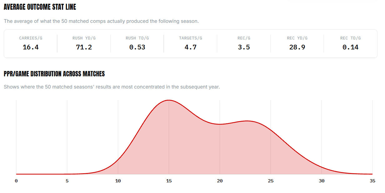
Next, we look at what each of those matched players did in the following season. We call this the N+1 season. That’s what actually builds our sense of what 2026 could look like, and it’s a lot more useful than a single projected number. Turning those 50 N+1 outcomes into a density plot tells us a great deal. For example, where the distribution is concentrated, how much of it sits toward the high end, and what a truly average outcome for this specific comp group actually looked like in real box scores. This provides a second, grounded way to sanity-check the ROO projection beyond a singular PPR number.
Adjustments for Tricky Profiles
There’s a key part of the process not mentioned above. For every position, we ran extensive testing to check whether this approach was systematically over- or under-projecting certain cohorts of players. That testing turned up a couple of notable groups that would require adjustment. As a result, the tool accounts for these instances.
For RB, the approach tends to underestimate true bell-cow backs. This likely happens because there are so few genuine three-down workhorses in the modern NFL that the matching engine struggles to find enough similar matches. For a player like Robinson, the tool accounts for this and applies a calculated upward adjustment to the numbers displayed. (These adjustments are made on a statistically calculated sliding scale. They are not blanket adjustments applied to any player falling into one of the identified groups.)
Similar adjustments are made for other cases. For example, testing discovered that the ROO tends to overestimate outcomes for veteran WRs due to the steep aging curve often found at the position. With that in mind, it adjusts scoring for these players downward on a calculated sliding scale as necessary.
There’s more math under the hood than we’ll get into here, but a lot of back-testing went into making sure the tool actually delivers on its goal and provides a realistic and useful range of outcomes for every player, not just a single guess. Remember, the Range of Outcomes tool aims to serve a different purpose than a traditional projection. As a result, I urge you not to just look at a player’s average or median and then rank him against his position. Spend real time with each player’s distribution and density plot. This will give you much-needed context when constructing your teams.
The Cool Thing About How the Tool Is Calibrated
One of the cool things about how the tool works is that we can easily understand its ability to provide useful ranges. If you took 100 random players and seasons since 2009 and checked how often the actual outcomes landed between each player’s 25th and 75th percentile projection, you’d expect that to happen right around 50 times assuming the tool achieves its objective.
To test that this is the case, I first pulled a random sample of 100 player-seasons. 49 of the 100 players’ actual N+1 season landed between the 25th and 75th percentiles. To be sure that I didn’t get lucky, I checked the same thing across the entire 16-year historical pool, which included over 5,300 player-seasons. That comprehensive check landed a hit rate of 48.8%, which was almost identical to my quick spot check. So while it’s not perfect, it’s close enough for the intended purpose.
I also checked how often players’ actual results fall outside of the entire range covered by their 50 comps. Across that same full historical check, that happened only about 4% of the time. So while there will be some outliers, and probably some interesting circumstances behind them, we can feel pretty good about the tool’s output. To be clear, neither result reflects poorly on the tool. Again, landing right around that middle band, with approximately 50% of outcomes landing between the 25th and 75th percentile, is exactly what a well-calibrated range is supposed to produce and is one of the main reasons the tool’s output is useful. Given that we’re trying to understand fantasy football ranges of outcomes and not something with far more dire consequences, I’ll take it.
The Practical Takeaway
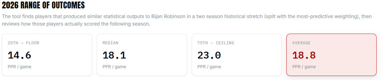
If Robinson played out the 2026 season 100 times, we’d expect that in roughly half of those seasons, he’d land somewhere between 14.6 and 23.0 PPR per game, with his results converging on an average of 18.8.
I really love reviewing the density plots because they tell you something the range alone can’t. In this case, Robinson’s outcomes aren’t smoothly distributed across his outcomes. They actually cluster around two separate peaks — one near 15.0 PPR/g, another near 22.5. This shape is telling us that his comp group didn’t tend to land in the middle, or at his average, as often as you would expect. Rather, they tended either to underperform slightly — 15 PPG is a disappointing outcome for the No. 1 overall pick — or to produce at a league-leading pace (22.5 PPG over 17 games comes to 382.5 PPR points, which would have been good enough for RB2 overall last year).
That’s a markedly different and more useful picture than just knowing his median is 18.1. A player whose distribution is smoothly centered around 18.0 and a player whose distribution splits into two humps that happen to average out to 18.0 are not the same player from a roster construction context. A single projection would treat them identically. This is exactly the kind of thing the density plot exists to surface, and exactly why I’d urge you to spend more time with the shape of the plot than just the average. Compare Robinson’s distribution to some of his peers, and you’ll see what I mean.
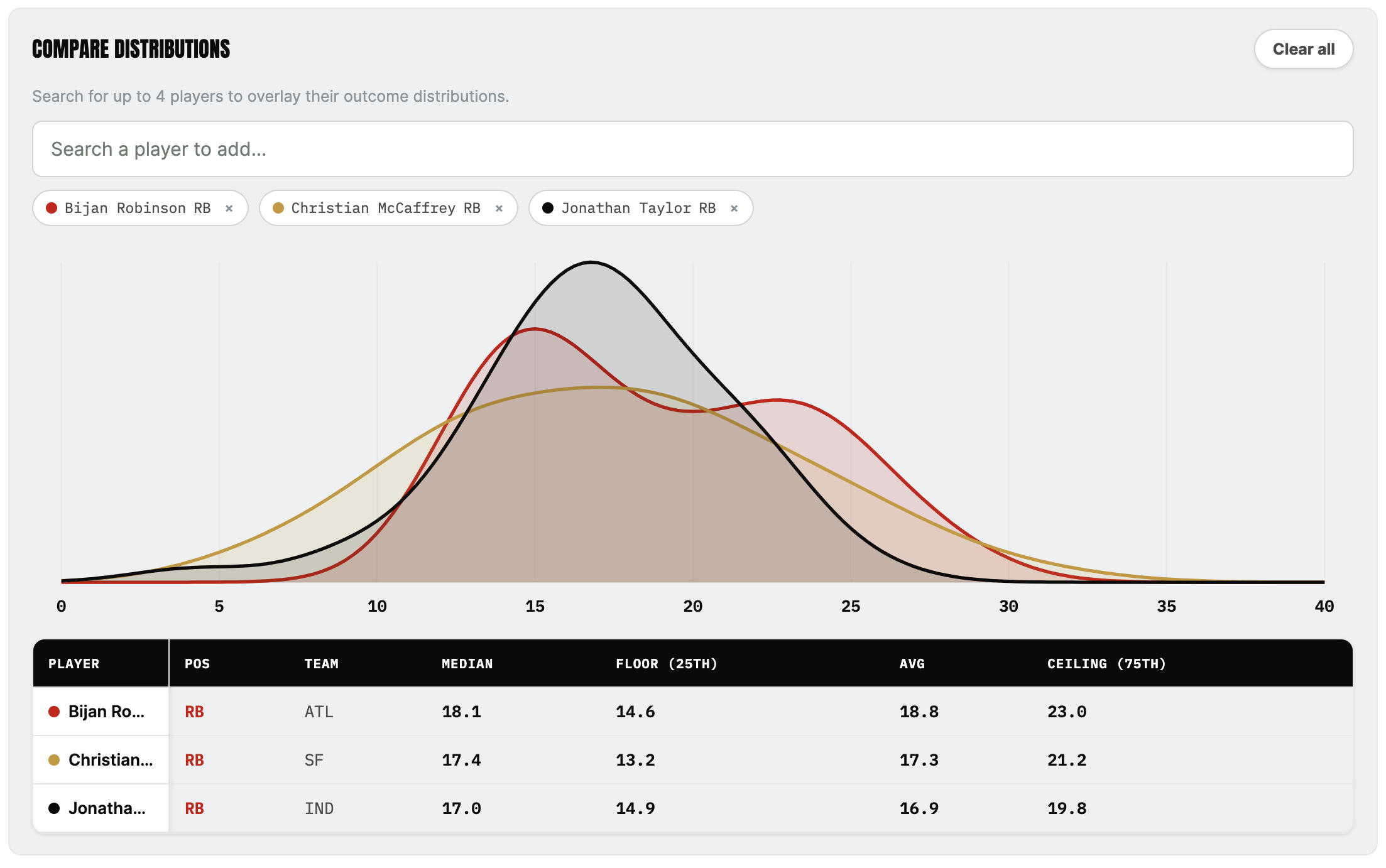
Robinson, Christian McCaffrey, and Jonathan Taylor all have very similar median projections, but they get there in very different ways.


